Severina
Branding (Strategy, Concept, Tone of Voice, Copywriting, Visual Identity, Packaging, Signage, Uniforms, Art Direction, Photography, Production). Naming. Digital Marketing (Strategy, Content, Graphic Design).
Buenos Aires, Argentina | 2025
Case Study
Severina es una cadena de cafeterías en Buenos Aires Severina is a coffee shop chain based in Buenos Aires with three active locations. The project involved redesigning its visual identity with the goal of modernizing the brand and connecting with a younger audience, while maintaining recognition of its existing name.
The brand already had an existing logo that had become outdated and failed to stand out in a highly competitive market. One of the main challenges was that the client’s value proposition was defined in very generic terms, using widely repeated concepts within the coffee shop industry, such as “a place to disconnect.” From this starting point, the focus of the project was to build an identity capable of standing out and creating a more authentic connection with its audience.
The project began with a structured brief developed through a questionnaire, complemented by research into relevant coffee shop references within the local context. This process helped identify recurring patterns in the industry’s communication and allowed for the definition of a more distinctive conceptual direction.
The creative concept was defined as an “urban picnic,” a reinterpretation of moments of pause and enjoyment within an urban environment. The idea is based on associating the coffee shop experience with a moment of relaxation, either alone or shared, similar to a picnic but adapted to everyday city life. This concept became the central axis for all visual decisions throughout the project.
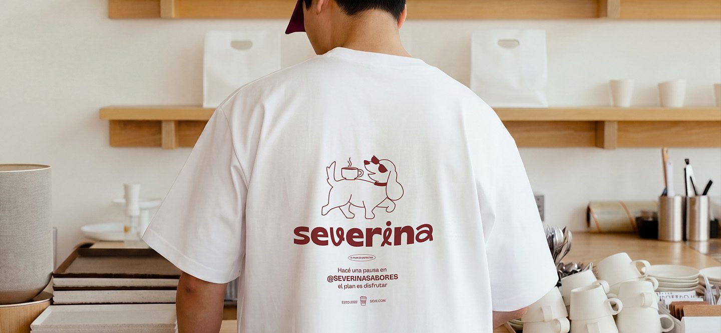
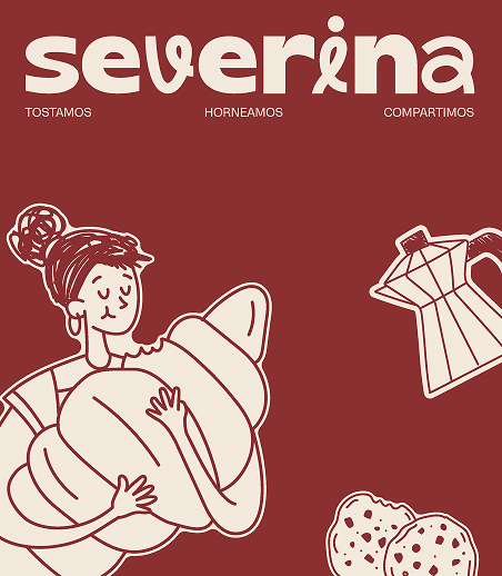
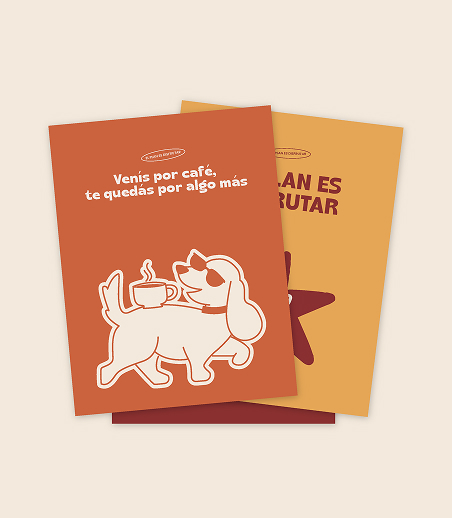
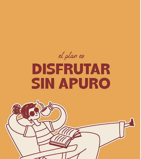
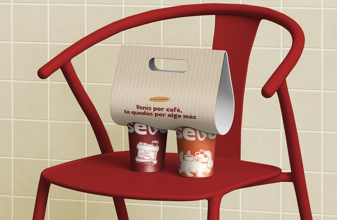
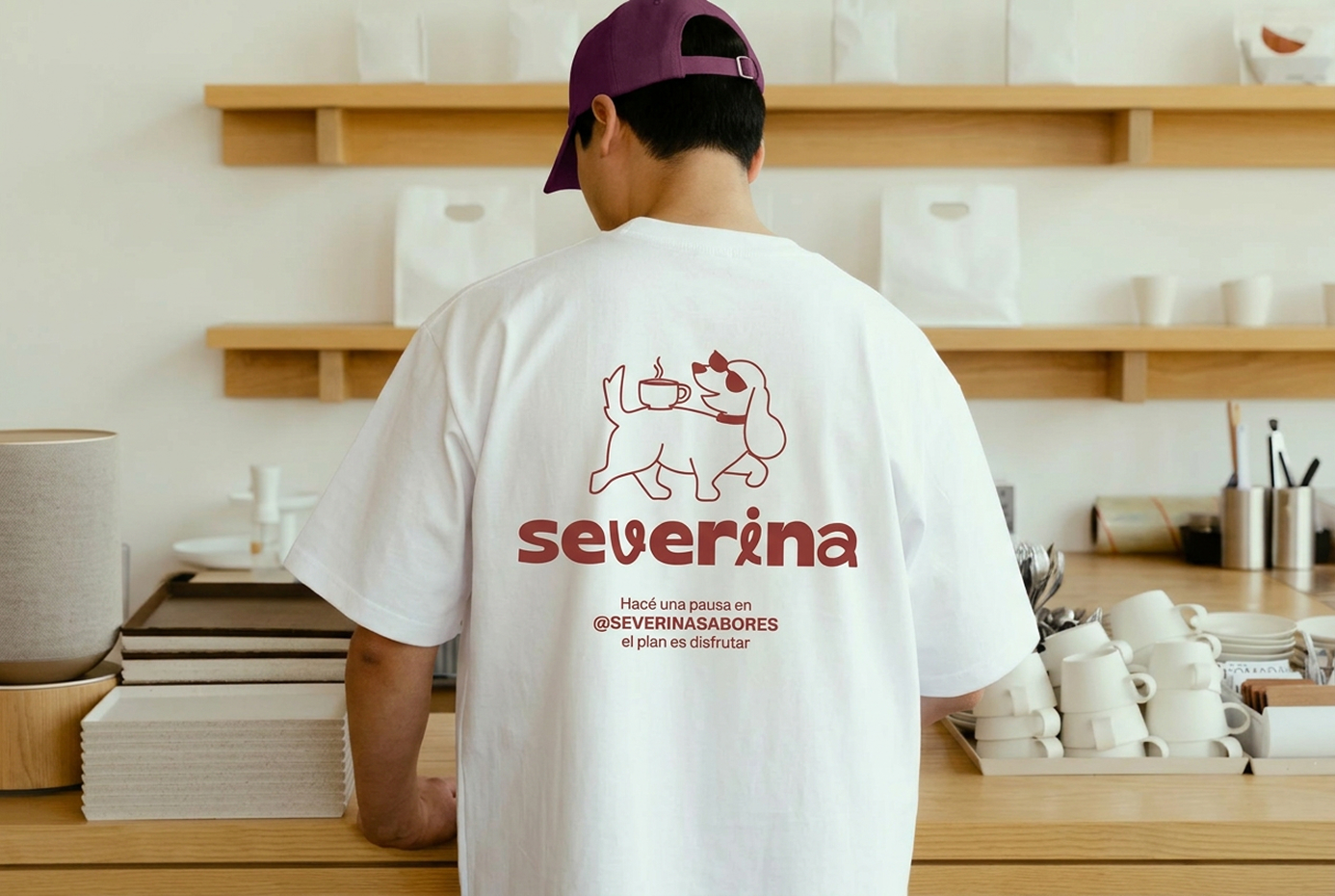
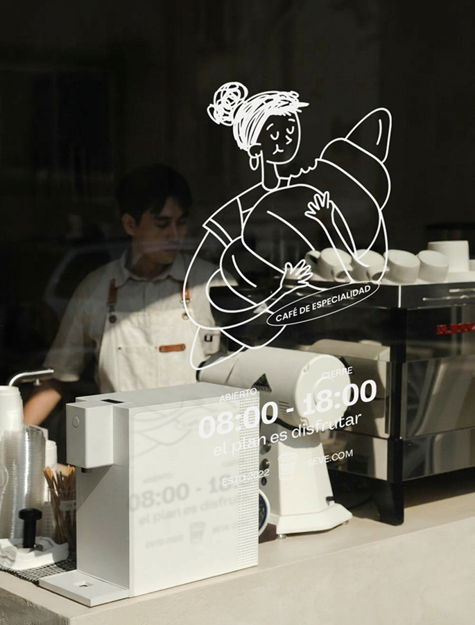
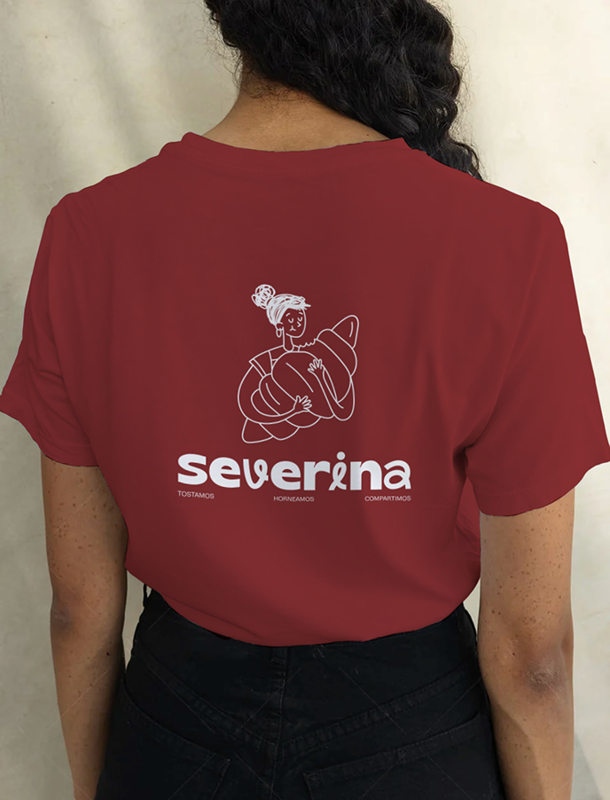
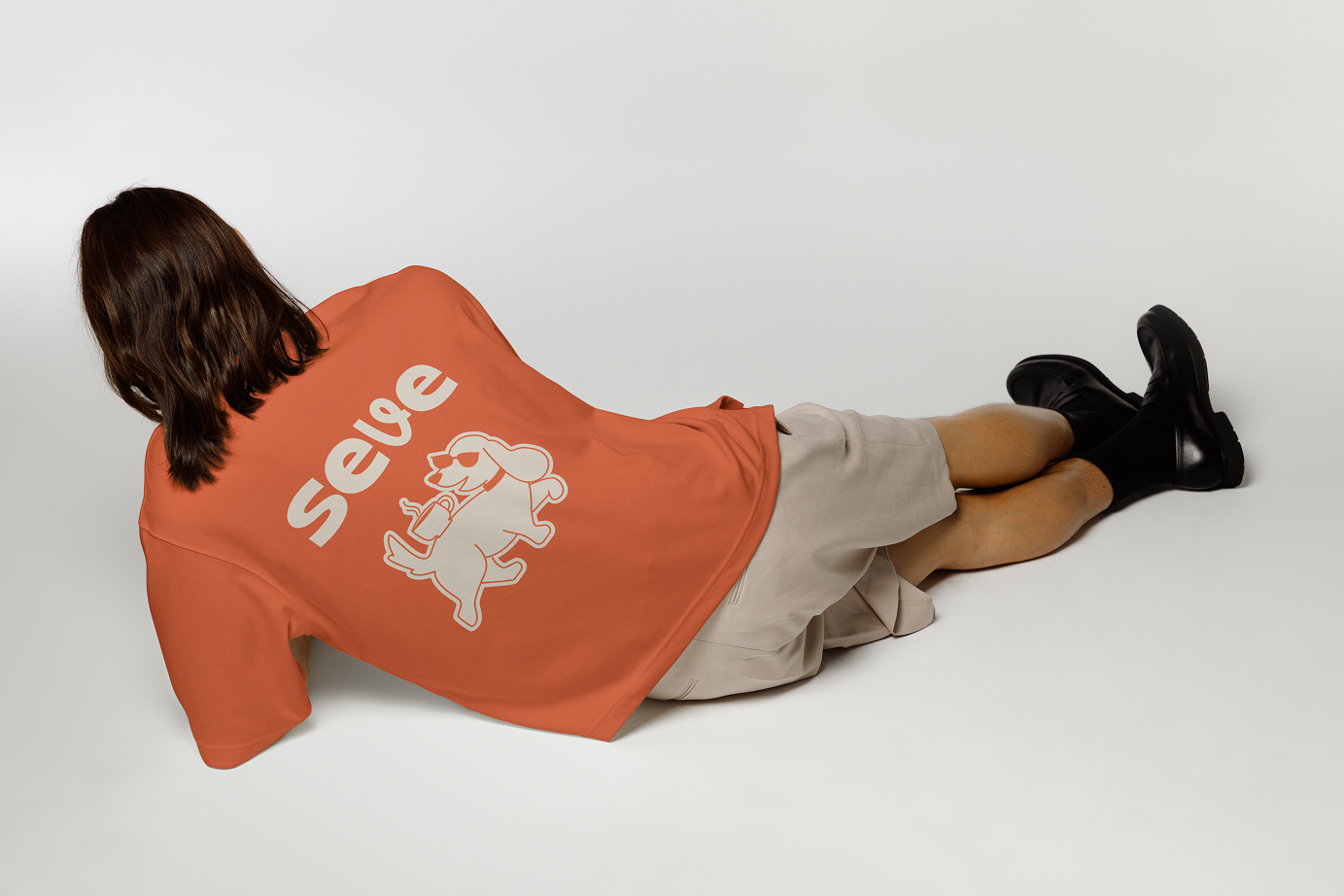
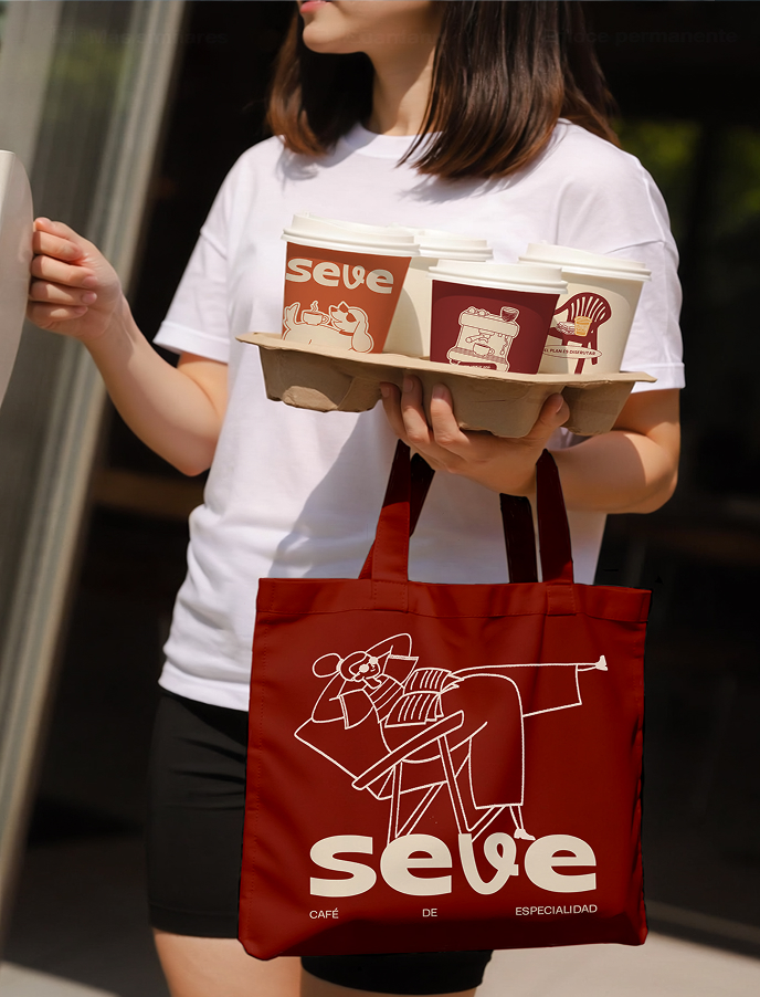
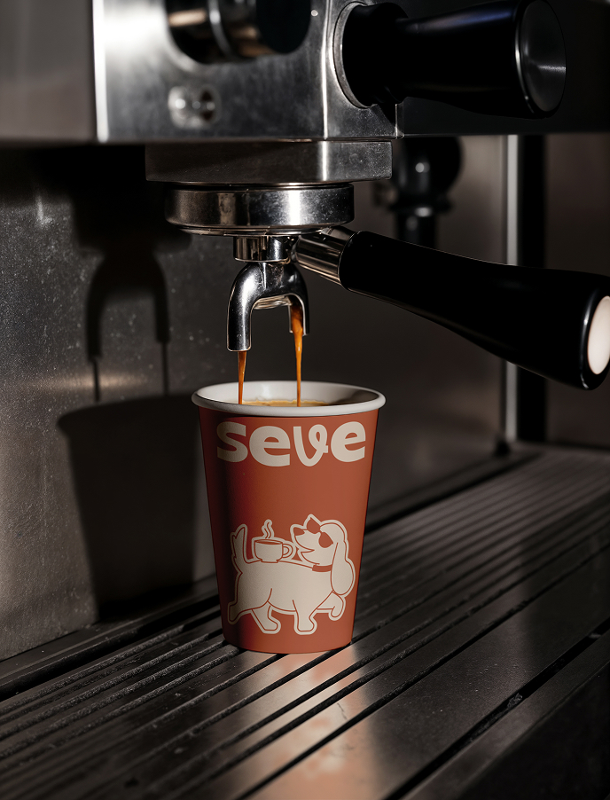
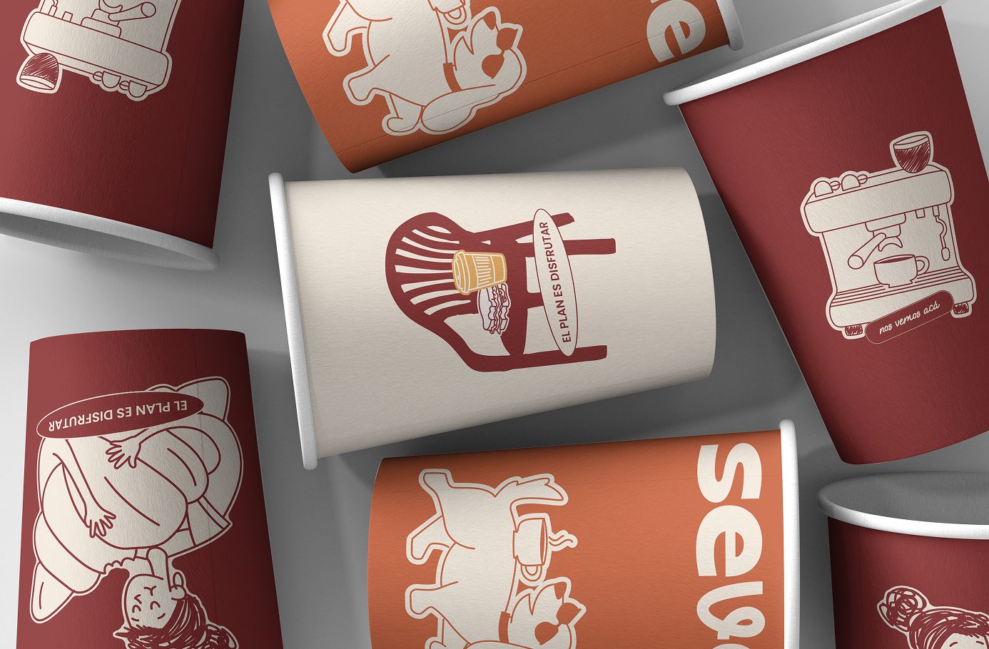
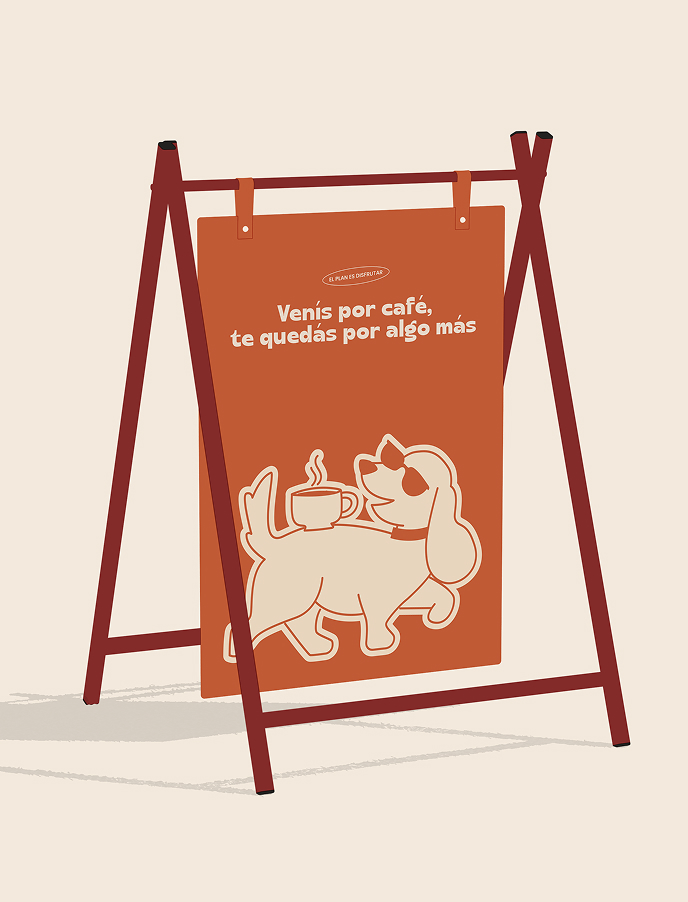
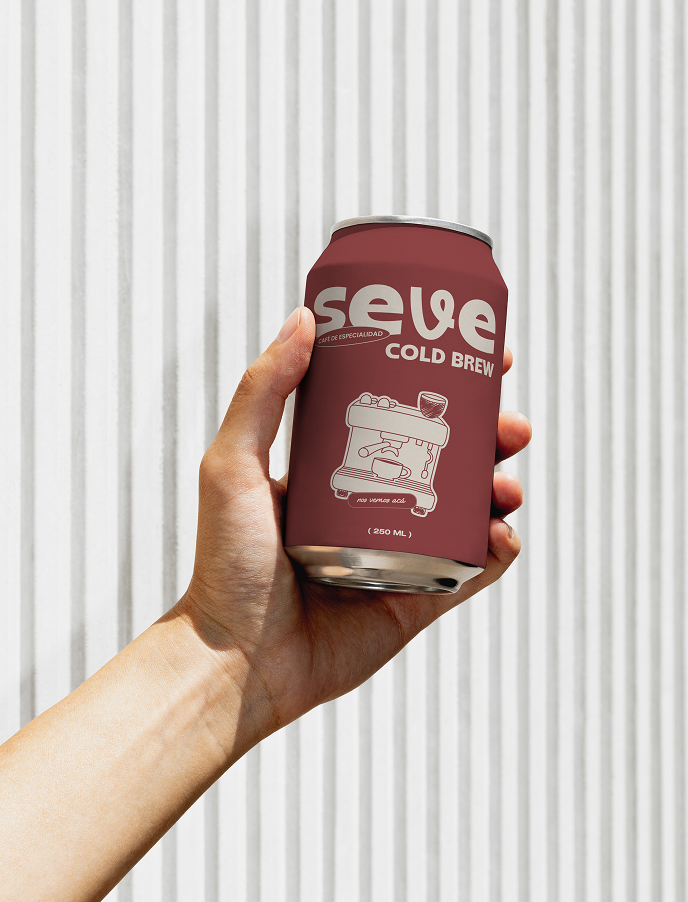
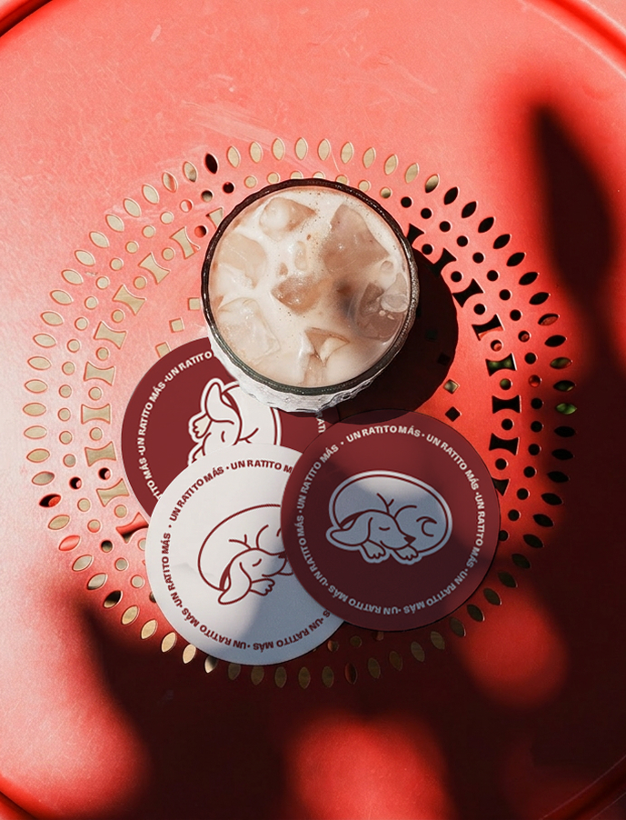
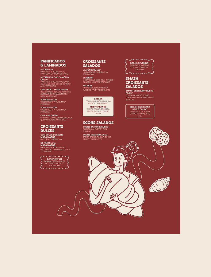
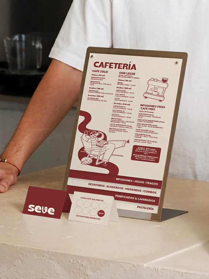
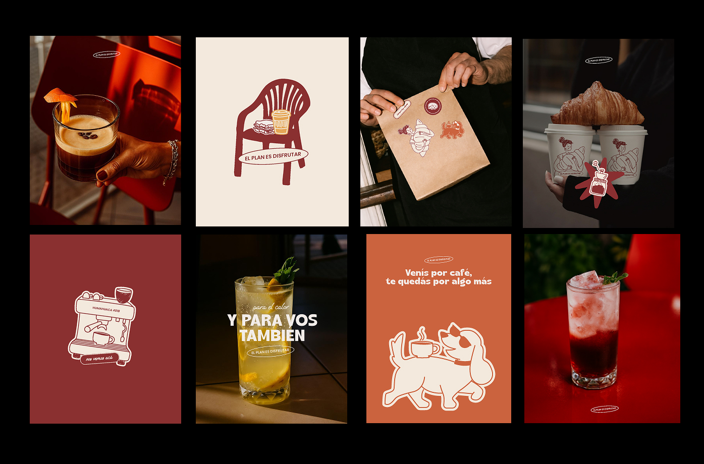
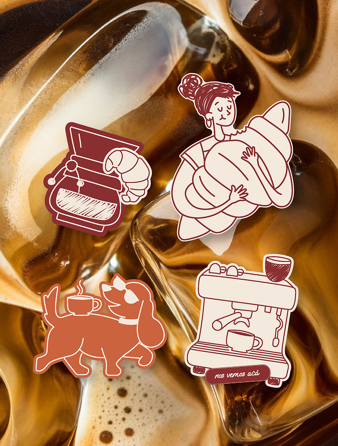
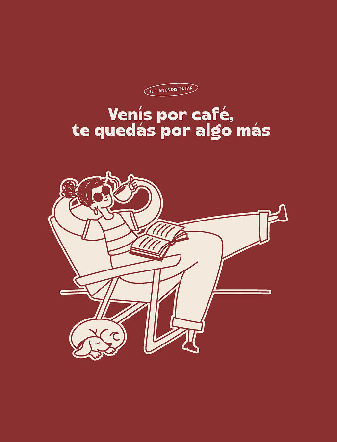
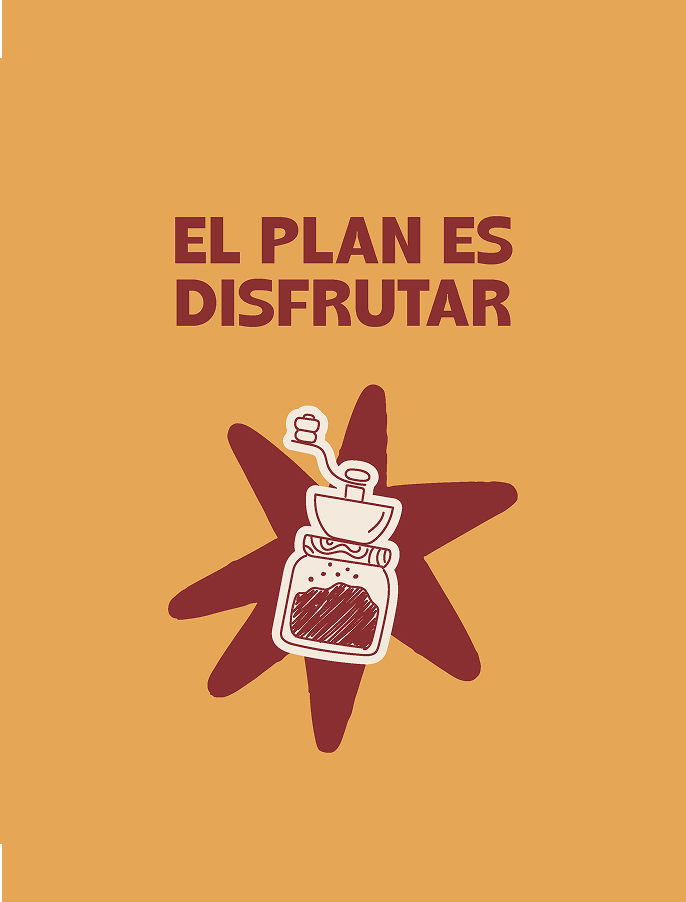
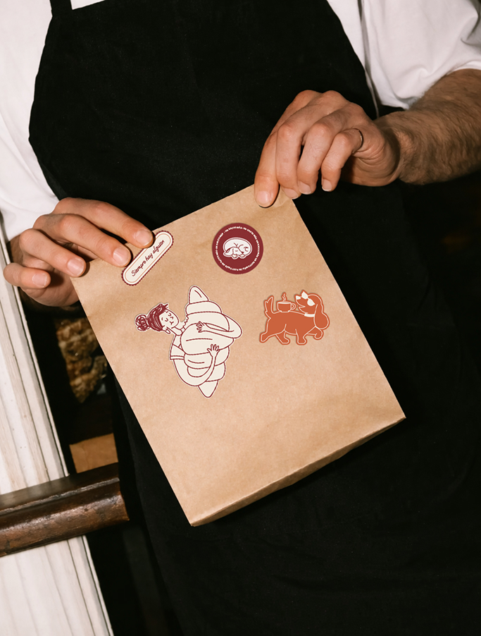
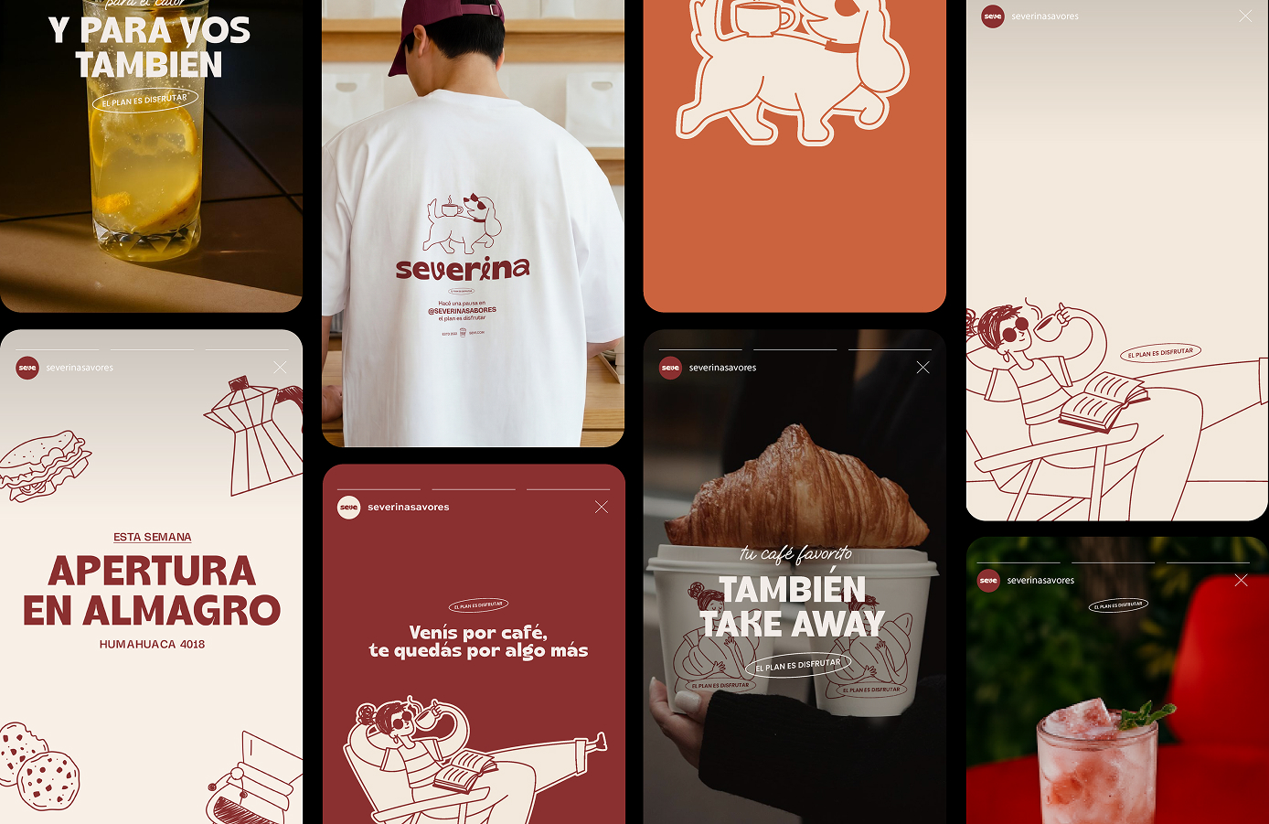
The art direction was led by me and developed through a structured brief and moodboard. I collaborated with an illustrator who translated the concept into a character-based illustration system based on these guidelines. The illustrations introduce warmth, approachability, and personality to the brand, helping to build a consistent visual language across all applications.
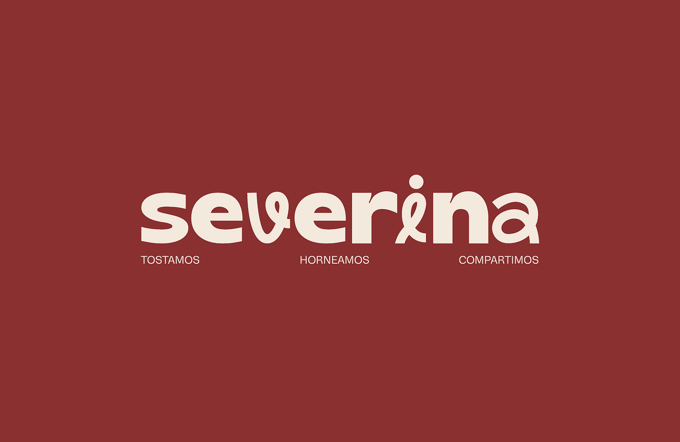
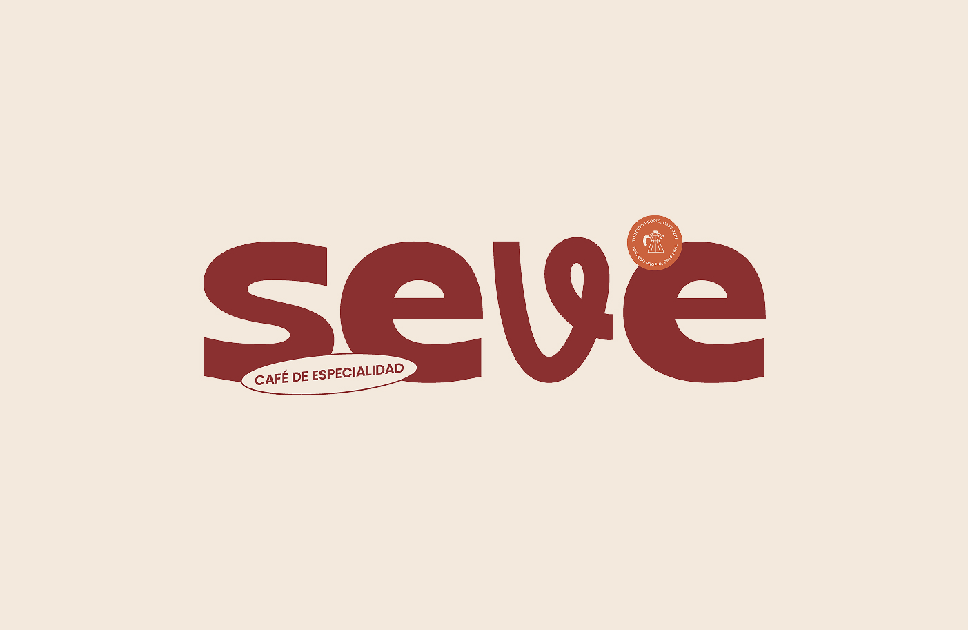
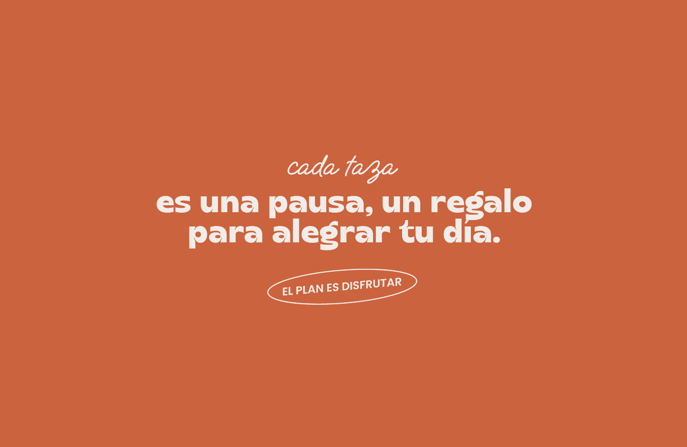
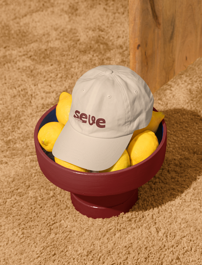
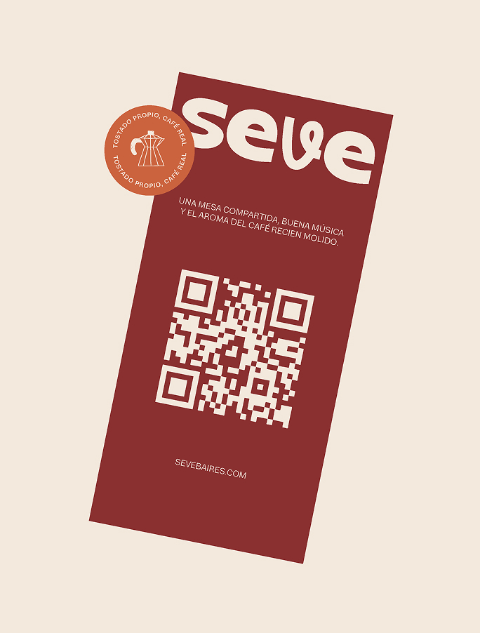
From a typographic perspective, a combination of typefaces was used to balance expressiveness and functionality. The primary typeface adds character and dynamism, reinforcing a modern and approachable identity, while a complementary sans-serif ensures readability across different formats. A script typeface was also introduced to add a more human and spontaneous touch, aligned with the relaxed nature of the concept. This combination creates a flexible system that maintains consistency while preserving personality.
The color palette started from a client requirement to retain burgundy as the primary brand color. Based on this foundation, a complementary palette of contrasting and vibrant colors was developed, aiming to refresh the brand’s perception and create stronger visual impact, especially in applications targeting a younger audience.
Multiple brand applications were designed to ensure consistency and versatility across touchpoints, including packaging, apparel, point-of-sale materials, merchandise, and social media content. The focus was on building a scalable identity system that maintains visual coherence across all formats.
The result is a solid and differentiated visual identity that positions Severina with a more contemporary and approachable personality, while establishing a flexible system capable of evolving alongside the brand.